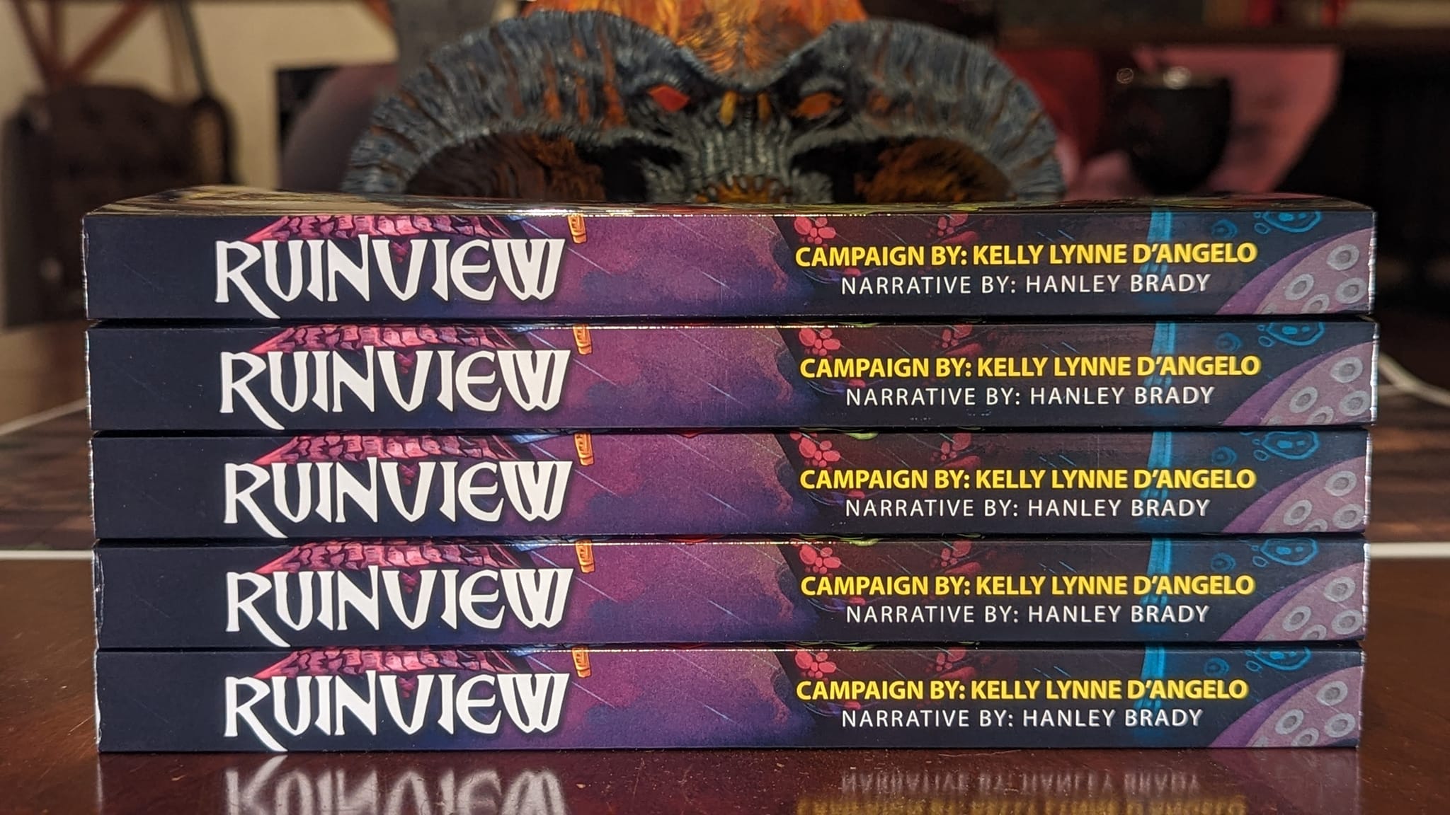
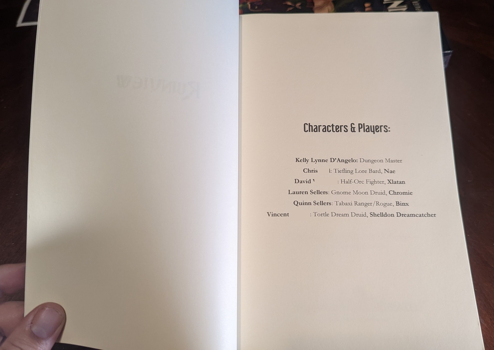
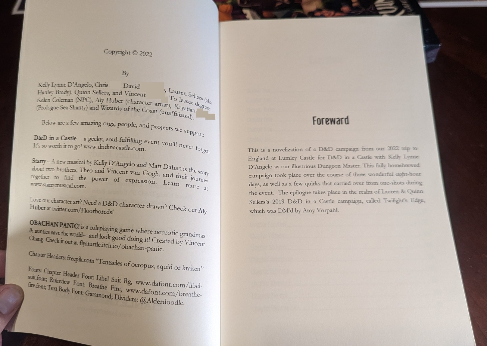
Ruinview Book Writing, Formatting, & Printing
If you’re looking for book formatting tips, you’ve come to the right place!
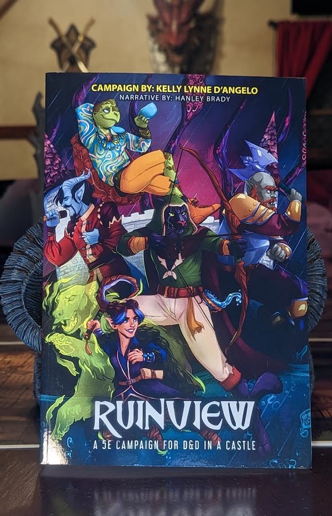
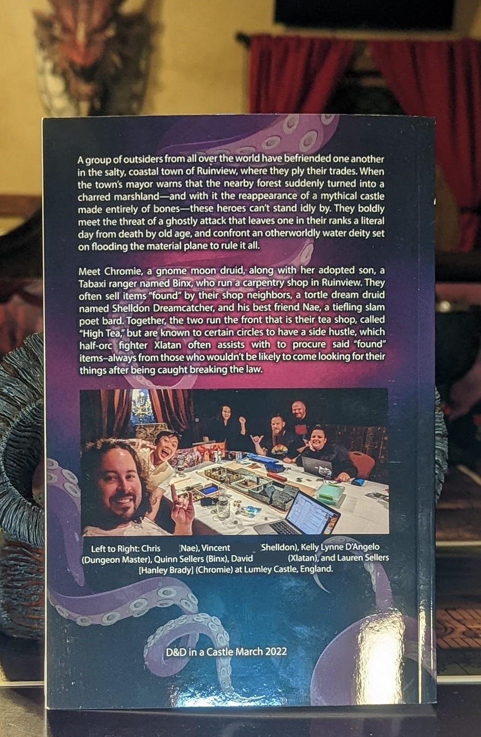
For the first time since our 2019 trip, Quinn and I were able to re-attend the D&D in a Castle event at Lumley Castle in England, with our Dungeon Master Kelly Lynne D’Angelo to play Kelly’s wholly homebrewed “Ruinview” campaign. I then novelized the campaign and printed it in novel form, much like I did for our 2019 trip to this event. You can see pics and details of our 2022 trip, as well as more detailed info about the book I wrote and printed for our Ruinview (2022) group. This post is about writing, formatting, and designing the book.
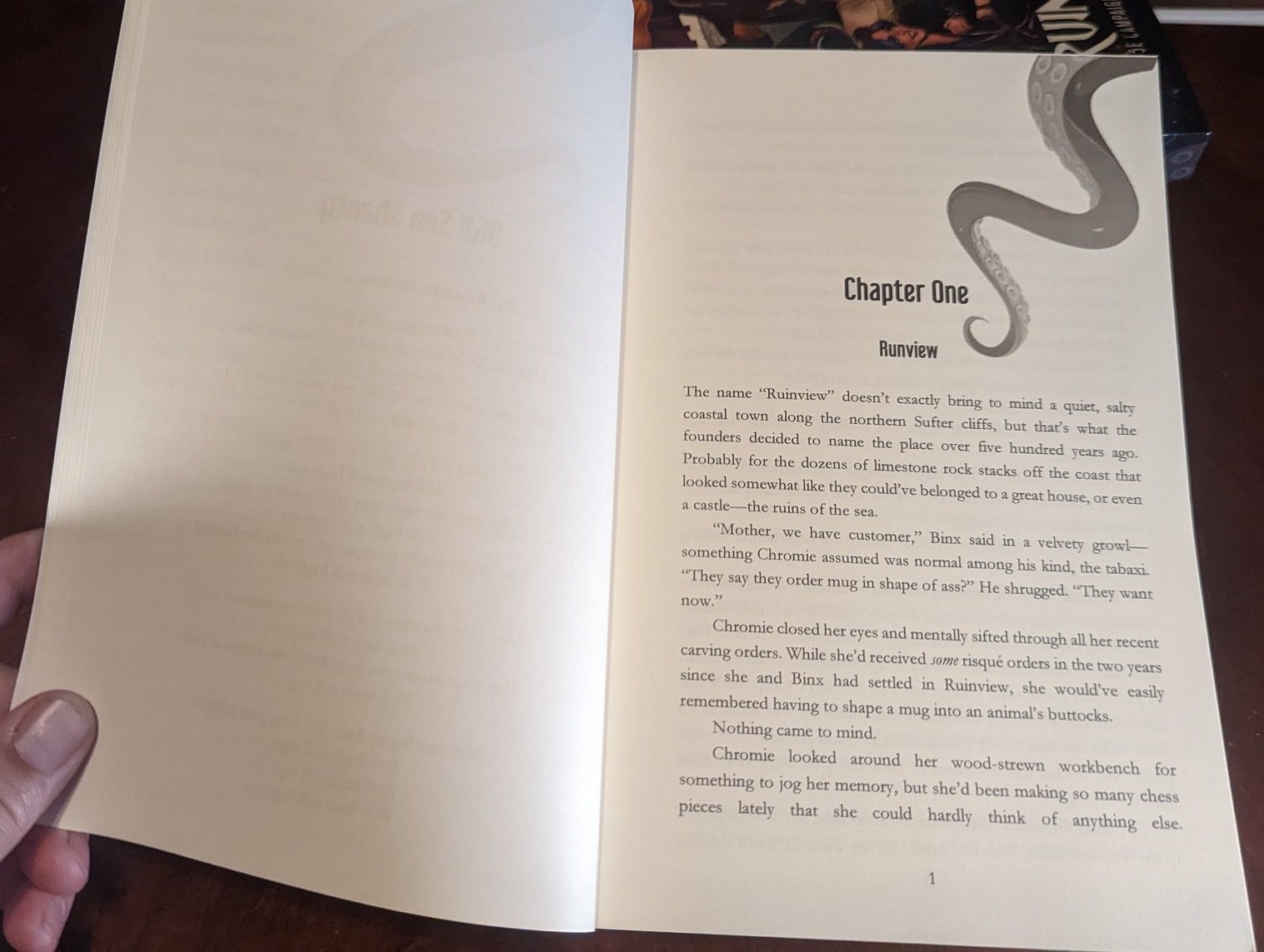
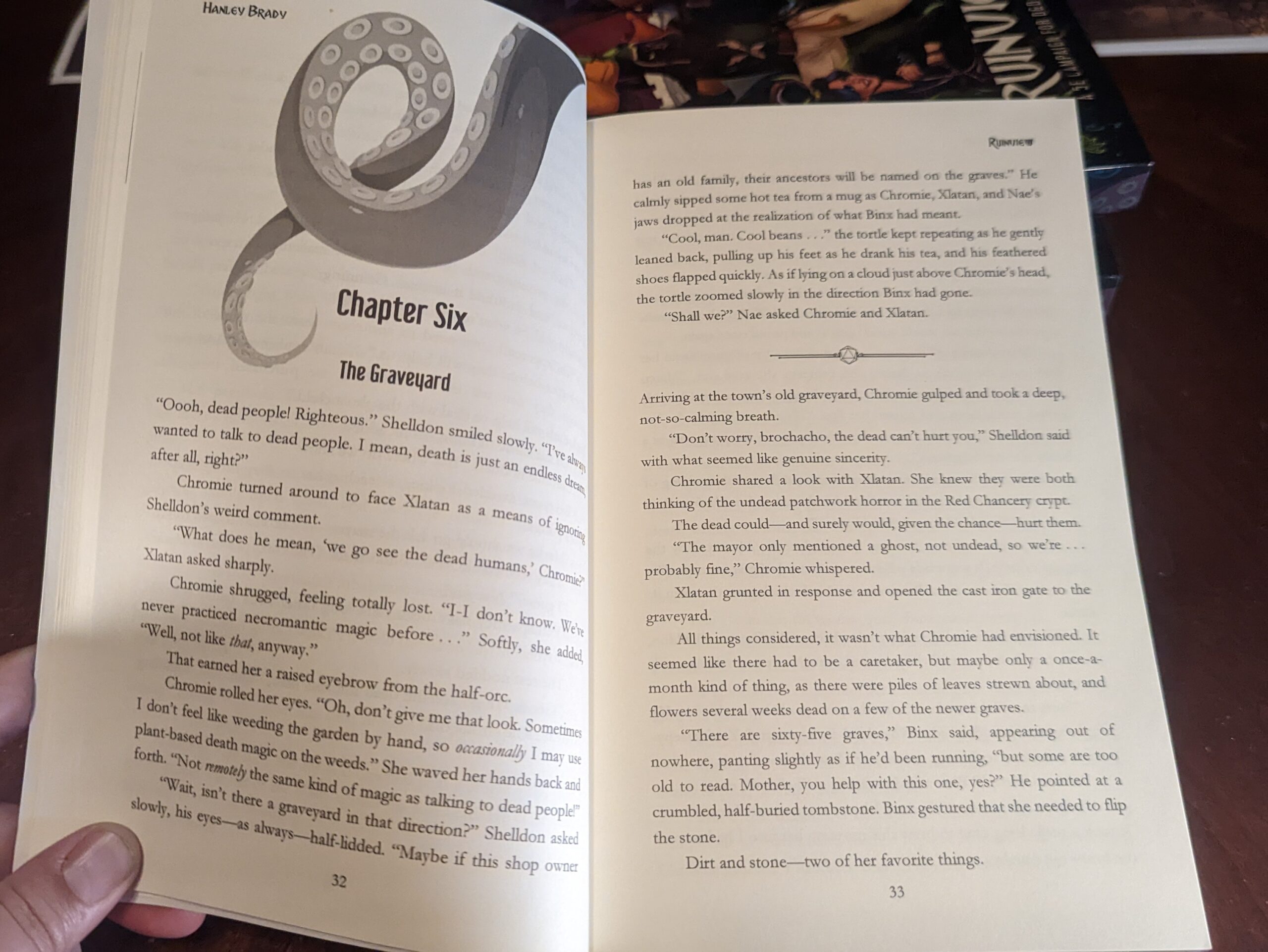
I decided to try something new this time around, including some small formatting changes (i.e. indent length), and some larger changes like chapter images. Since we had a kraken trying to invade the realm, and our BBEG was an Aboleth, tentacle chapter headers seemed like the thing to do.
Note: I used a PC with Windows 11 and Office 365 as my version of Word (Nov. 2022) for this project.

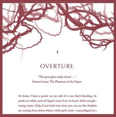
Sample picture 1

My Writing & Design Process
Artwork as Prep Work
The first thing I always do with a new creative project is get some artwork made to help motivate meeting my writing goals and better visualizing how everyone actually looks.
After going through my twitter list of artists I keep tabs on to see who was available for commissions, I was super excited to see that Aly Huber was available! They are amazing, and you’d be so please to work with them on anything you need drawn.
I don’t know how they did it, but they turned my nonsense reference picture (below) into a true work of art that makes us look like rock stars. There was more written description in the email to the artist, but this was the general idea I had for a movie poster-like group pose.

Last time, I commissioned individual characters, and my cover designer had to finagle getting everyone to look like they belonged on a cover together when they weren’t drawn that way. This time, I wanted something that would more cohesively fit on a book cover. Aly Huber nailed it.

Writing Timeline & Regimen
I had a fairly detailed 17 page outline of the entire campaign (something I do for all my D&D games to track NPCs, loot, etc), plus I lived the 32 hours or so that we played the game, so I KNEW the plot and characters. That said, I wasn’t as detailed in my notes this time around regarding combat because I LOVE combat and prefer to be in the moment with it, rather than writing down every hit and reaction.
While it was more fun to play that way, it was frustrating to write because I had to rely on memory or make things up any time there was a fight scene (and there were a lot). Next time, I think I’ll ask the group for permission to record audio of the sessions (or at least the combat sequences) so I have a more accurate memory of the attacks, near deaths, and funny lines.
Anyway, because I’d lived the story and had a detailed outline, I knew that I’d be able to follow a similar timeline of start-to-finish from my 2019 book. I’d told the Ruinview group in April 2022 that I estimated I’d have physical copies for them by Thanksgiving (Nov 2022), and hot damn, was I right!
I REALLY pushed myself with the 2019 book, writing 90k words in 90 days. It was a lot. I didn’t do that this time. Instead, I scheduled myself with an easier goal of 1k words per weekday, or an average of 5k a week. The book (ultimately) came out to a little over 83k words after 3 drafts, and the first draft took me 16 weeks to write (April-August), coming in at 77k words.
For those unfamiliar with word count as a measurement, the writing world doesn’t measure book length by page count because font size/line spacing affect page count. 85k-120k is average for an adult fantasy novel. 60-90k words is average for Young Adult fantasy. 50-75k is average for middle grade fantasy. (The fantasy genre gets a higher word count allowance in the publishing world because of the required world building, which adds more words than contemporary fiction would need).
I then planned to take a month off before editing, so as to have fresh eyes on the work. But, I’d scheduled a copyeditor in April for an October edit, and I was worried about not having enough time to edit since I knew I’d be on a family trip at the end of September. So…I took a weekend off, and then started a thorough edit that took 5 weeks, increasing the word count from 77k to 83k in the process as I filled in some emotional moments and plot holes.
I did a final polish with Grammarly before my trip, which wasn’t super helpful, but it did catch a few missing dialogue tags and quotation marks. It wasn’t helpful because one of the main characters had a unique way of speaking that Grammarly hated, so it was a slog to get through and ignore all of Grammarly’s “recommendations” any time he spoke. While on my trip, I did a little more editing when I had time, but it was targeted at scenes I thought needed further clarity.
I worked with Katherine Kirk as my AMAZING copyeditor. Since I wasn’t publishing this book, I just wanted line edits for reading flow. The plot/story was set in stone, so I didn’t care about developmental edits, as I didn’t want to change the plot. This is also how I was able to stick to the 1k /week writing schedule: because I just had to document what happened, in a narrative fashion, rather than worry over plotting, foreshadowing, character arc development and balance, etc., I could write at a faster rate than my normal novel writing. Katherine was very communicative and professional, and provided great insight and information about her suggested edits. I’d highly recommend her!
Book Formatting
Here are some pictures of the final product, before getting into the ‘how I did it’ steps.
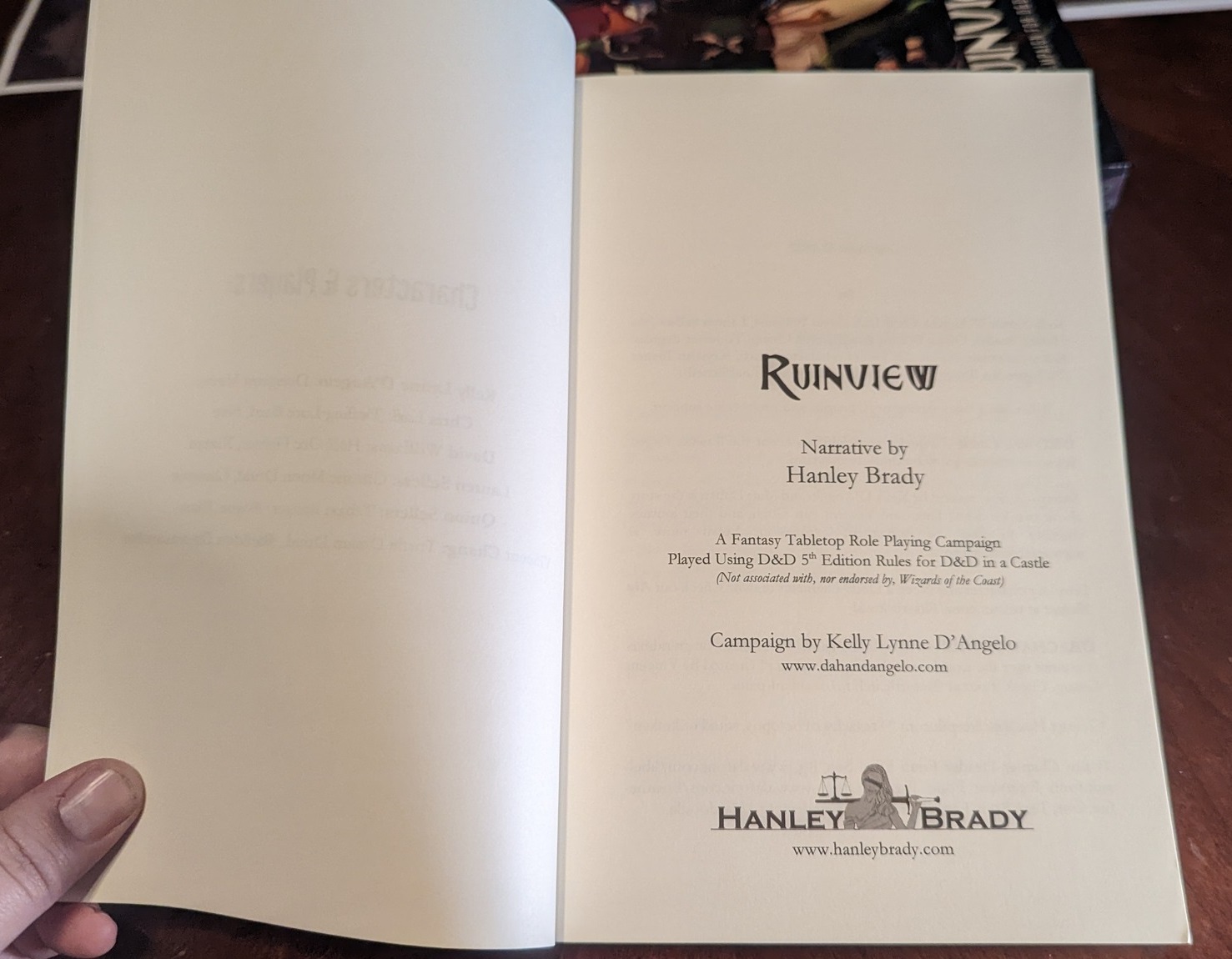
Title Pages
(Note, if you’re printing through somewhere like LuluExpress (more details on that process further below), your first page will be on the right side of the book, regardless of how Word makes it look. When printed, the first page is always on the right side. Organize your front-end content accordingly (i.e. copyright page, acknowledgements, dedication, foreword, etc).

Ruinview title font: Breathe Fire (since I’m not publishing this story, I don’t care about commercial licensing–always check with licensing requirements/restrictions before using a font for commercial purposes).
Font size: 40 pt (Breathe Fire)
Paragraph indents & spacing for title pages:
Alignment: Centered
Outline level: Body Text (based on my personal formatting)
Indentation: Left: 0″, Right: 0″, Special: (none) By: (blank); mirror indents unselected
Spacing: Before: 150 pt; After: 24 pt; Line spacing: multiple; At: 1.08; “don’t add space between paragraphs…etc” is left unchecked
Chapter Headers
Chapter title font: Libel Suit Rg (same disclaimer re using any font for commercial purposes). I used this font for my Twilight’s Edge book from 2019 and liked it enough to use it again here.
Font size: 22 (Libel Suit Rg)

Chapter Header Indents & Spacing:
Alignment: Centered
Outline level: Level 1
Indentation: Left/Right: 0″; Special: none; by: blank
Spacing: Before: 150 pt, After 24 pt; Line spacing: Single; At: blank
Chapter Subtitle Formatting
Chapter subtitle font: Libel Suit Rg (same disclaimer re using any font for commercial purposes). I used this font for my Twilight’s Edge book from 2019 and liked it enough to use it again here. I started off using chapter names just to remind myself the basic plot of each chapter so I’d know where I was in an outline view, but then it got pun-ny so I kept them.
Font size: 15 (Libel Suit Rg)

Chapter Sub-Header Indents & Spacing:
Alignment: Centered
Outline level: Body Text
Indentation: Left/Right: 0″; Special: none; by: blank
Spacing: Before: 0 pt, After 0 pt; Line spacing: Multiple; At: 1.4
Chapter Body Text (Line Spacing)
Chapter body text font: Garamond. It comes with MS Word. I like it a little better for fantasy novels than Times New Roman.
Font size: 12 (Garamond)

Chapter Body Text Indents & Spacing:
Alignment: Justified
Outline level: Body Text
Indentation: Left/Right: 0″; Special: none; by: blank
Spacing: Before: 0 pt, After 0 pt; Line spacing: Multiple; At: 1.25
Chapter Body Text (Margins)
The margins looks weird because (1) remember that chapter 1 is technically a right-sided page when printed (hence the importance of making sure you count properly from the similarly right-sided 1st title page so that chapter 1 starts on a “right” sided page), and (2) the sizable margins are there to give the text a safe distance from the gutter (middle of the book) so the reader can read everything comfortably when opening the book.

Chapter Body Text Margins:
Top: 0.8″
Bottom: 0.7″
Left: 0.5″
Right: 0.5″
Gutter: 0.5″
Gutter Position: Left
Orientation: Portrait
Pages: Multiple pages: Normal
Apply to: Selected Sections
Header & Footer Formatting
No joke, the page numbers probably took me 2 hours to finalize, as I’d pre-formatted the book in anticipation of receiving copy edits, and I guess they got messed up when I first did the formatting. The issue I ran into was the “link to previous” tool. I wanted all front matter (everything before chapter 1) to have no page numbers (so I “linked to previous” to the title page, which had no page numbers), and I wanted chapter 1 to start as page 1 (so all later pages would “link” to that and the next page to copy page numbering and header formatting).
Despite my best efforts, something got wonky and I’d randomly have page numbers on a few of the front matter pages, and despite the sections not (visibly) being linked, if I removed the page number from the earlier pages, then either all or half the page numbers would disappear elsewhere. I ultimately had to undo all ‘link to previous’ and reapply the ‘link to previous’ for the front matter section and then the chapter sections to make the page numbers cooperate. *shrug*.
I’ve also had to utilize the ‘different odd & even pages’ tool because I wanted the book title and my author name on alternating pages, which meant the footer page numbers had to link properly to the right section to reflect that as well.
If frustrated, save a copy of your work and title it some kind of curse word so that if you mess things up while fiddling with the formatting, you haven’t messed up your master file. Then, if you fix it all, just rename it the next draft number.

Header & Footer Settings:
Header from Top: 0.4″
Footer from Bottom: 0.3″
Check-marked: Different First Page; Different Odd & Even Pages, and Show Document Text
Footer Page number font: Garamond, size 11
Header Font: Breathe Fire, size 11
Chapter Images & Dividers
Chapter Images
I read yet another article on tips for formatting self-published books, and saw that one of the authors had chapter page images. It just hadn’t occurred to me before, so I immediately looked around for ideas before landing on the kraken-styled tentacles. I made them greyscale because I’m only printing in black and white. Below are some sample chapter images I found as inspiration.
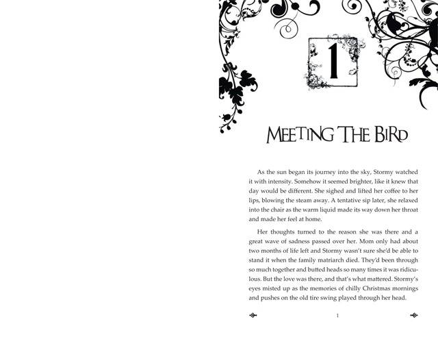

I had to go through every page in the story to make sure to delete some of the inadvertent blank pages (these margins affect normal page spacing) and then ensure all the tentacles were placed such that they did not block either the title header or the author header words. I then flipped them around and had a pretty complicated charting system to make sure I didn’t use the same one too soon after its previous use.
Scene Dividers
Another way to further emphasize the geekiness of the story was to customize the text dividers (sometimes there’s a time or scene break that isn’t quite a chapter break, so there’s a divider to indicate that time/place has changed since the prior paragraph. I used dividers from Alderdoodle’s Kofi store to break up the text. Keeping my copyeditor’s spacing of the ### I’d used as a placeholder for scene breaks so that the spacing would be uniform for each scene break usage.
I liked this because it’s a 20 sided dice, rather than the usual vines or fancy swirls.


I made the image wrapping “in front of text” and placed it centered on the formatted ###, then just deleted the hashtags, but not the line they were on, and the formatting looks great.
Alignment: Centered
Outline Leve: Level 3
Indentation: Left/Right: 0″; special: none; by: blank
Spacing: Before/After: 18 pt; Line spacing: single; At: blank
I also used Alderdoodle’s page number dice decor as an ending divider (also shaped like a 20-sided dice), and added ‘the end’ in the book font inside.

Book Printing
I print with Lulu Xpress (not to be confused with the parent company, Lulu). I’ve printed 3 books with them and have been happy with their pricing and user experience, and love that there’s no minimum number you can print (I once printed a single copy of my own novel, Imaginary, to help with doing line edits).
Lulu Xpress is easy to understand the options they give, though the Pandemic has made the price of printing fluctuate as paper supply goes up and down. Also, while I prefer to print books on cream colored paper (rather than pure white, which is harder on your eyes in direct sunlight), they warned that they will print on cream if they have it, and if not, you get pure white.

Here is the overview of stats I chose:

Trim Size: US Trade (6″x9″ / 152x229mm) — trade size means fewer pages to print, which means each book is cheaper to print than a mass market size with more pages. I don’t bother with figuring out hardcover because this is a hobby project.
Page Count: 314
Interior: Black & White Standard
Paper Type: 60# Uncoated Cream (60# is thick enough to not easily see the text through the page; lower # means the paper is thinner)
Binding Type: Perfect Bound (standard novel binding type)
Cover Finish: Glossy (I haven’t tried matte finish on a book, but I don’t think I’d like it)
Price Per Book: $9.03 (on Nov 6, 2022)
I don’t know if the image will be big enough to see, but this is what their interface looks like to make the above selections:
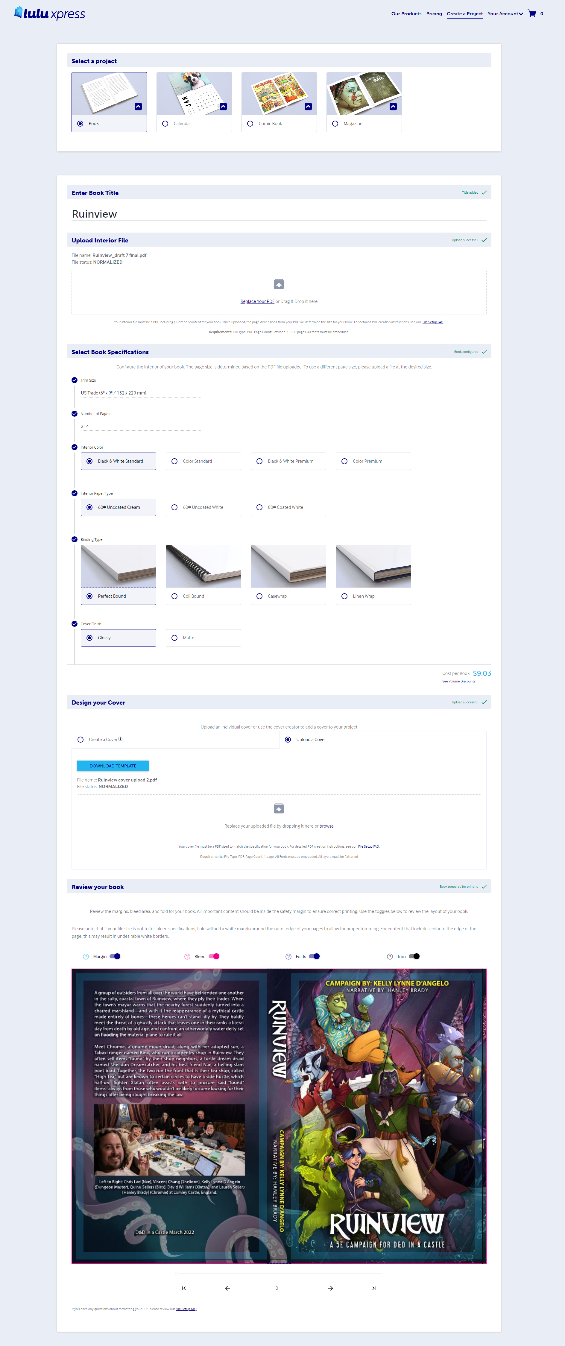
You just need to have a PDF of your fully formatted book and cover to upload. The site then gives you page-by-page preview of what it’ll look like when printed, from cover to final page.
MAKE SURE YOUR TEXT IS INSIDE THE BLUE PREVIEW BOX. OUTSIDE THAT BOX GETS DICEY FOR YOUR READER AND PRINTER.

It looks like they’ve upgraded their system since 2019, because when my estimated dimensions for the cover were not correct, it now generates a PDF of the dimensions you need for the cover based on the size and page count of your book, which you can then deal with in Photoshop to make your cover the right size.
Cover Design & Formatting
In 2019, I used a Fiverr artist to cobble together a book cover using the 6 individual characters I’d had commissioned after our game. This time, I had the artist do a poster style depiction of our characters so that it’d be easier to make into a vertical book cover. Next time…I’ll remember to specify that the dimensions should be in the 6×9″ ratio, as the image I received was slightly shorter than that and I had to do some band-aid stitching to increase the length of the artwork to fit the book’s dimensions. But, I at least remembered to ask the artist for the original background shading image they used, so I could have that as my book back cover background and match the front image.
This is a sample of what the template would look like that Lulu provides if your dimensions are not correct (this is an older template, as I can’t seem to find the final one). Every book will be different, but they’ll let you know what you need.

I then put the Lulu template into Photoshop and added (teal) grid lines wherever there were boundaries (i.e. the different color boxes), so I’d know how to center everything on the front, back, and spine. I didn’t care about leaving a barcode area since I wouldn’t be having a barcode printed, but watch out for it if you do. While I don’t love having part of Nae on the spine, I tried my best to at least keep his face on the front cover (hence my next project will specify the dimensions of the image to best fit on the cover, rather than just say it should be vertical). My fault, not the artist’s.

Phew! You made it to the end! Thanks for reading, I hope this helped! If you have more questions, here are some other resources I’ve referenced in learning to format my books:
This is also a good reference, but note it is from 2015
Some other Resources:
Fantasy Fonts (remember to watch the license requirements)