Ever wanted to print your own novel? How about novelizing a D&D campaign? If so, you’re in luck! While I one day plan to pursue traditional publishing options for my own novel, this project was never intended for commercial use, so I had to figure out how to print my own book if I wanted my vision to be fully realized. My method wasn’t exactly the cheapest route, but this post will go through what I did and how (or at least link to where you can figure out how).

Step 1: Write the Book

Obvious, I know, but the rest of this post doesn’t matter if you don’t have a finished book.
In my case, I had it slightly easier than writing a normal novel because I didn’t have to worry about plot, pacing (to some degree), or character arcs since all of that was already set in stone from our D&D campaign sessions, and I just had to make it “novel-y”.
To do that, I wrote in third person POV, with each chapter told from a different character’s point of view, and I ensured each character received the same (or close to it) amount of chapters. I avoided the meta aspect of stating numbers for the amount of damage done or taken, and instead described it as hitting an enemy with a generic name (i.e. tried not to use Wizards of the Coast’s spell names) for attacks and the reactions of characters or enemies to such occurrences.
Other than that, it was normal novel writing and beat structure. Oh, well, except for combat–it’s super weird to try and narrate D&D combat from one character’s point of view while the events in progress technically occurred in a turn-based fashion. It was an interesting challenge to keep the chapter character’s actions and thoughts relevant while other people were technically doing actions and the narrating character (technically) was not.

For further information you didn’t ask for, this whole project sprung up while I was playing D&D at D&D in a Castle with Amy Vorpahl as our dungeons master, and players Miriam, Mike, Steven, Andrew, and Quinn. We, the players stream monthly D&D one-shots on Twitch/YouTube.
I took a small amount of notes about our first D&D session, per my usual so I could remember NPC names and places, but they weren’t exactly what you’d call “detailed.” I think I had maybe 3 pages of scribbles and most were about derpy cloud chickens and reminders for my spell bonuses. The idea of turning the experience into a book didn’t hit me until that first night.
Then, I took notes starting with the second session in a blow-by-blow kind of fashion so I could better remember attacks, stand-out dialogue, etc. Because so much happened so fast during our sessions, and because I didn’t want to disrupt everyone by typing, my handwriting quality left a lot to be desired–especially on the one-shot we did on the bus ride to the airport.

After I wrote everything down, added Andrew’s awesome short stories and poems, as well as included the text for the title pages etc., my document came out to a whopping 106k words. Most adult fantasy novels are between 95k-120k words.

I never planned for the story to be that long, I thought it’d be more like 30k words (a novella). Yay me?
Step 2: Find an Artist
Remember, this post is about the process I went through; it’s not a road map everyone should follow.
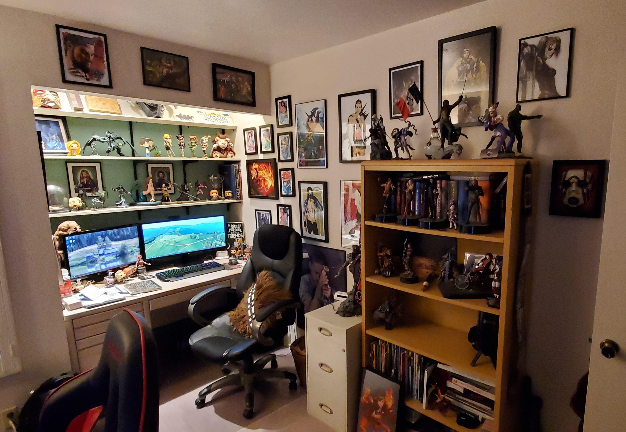
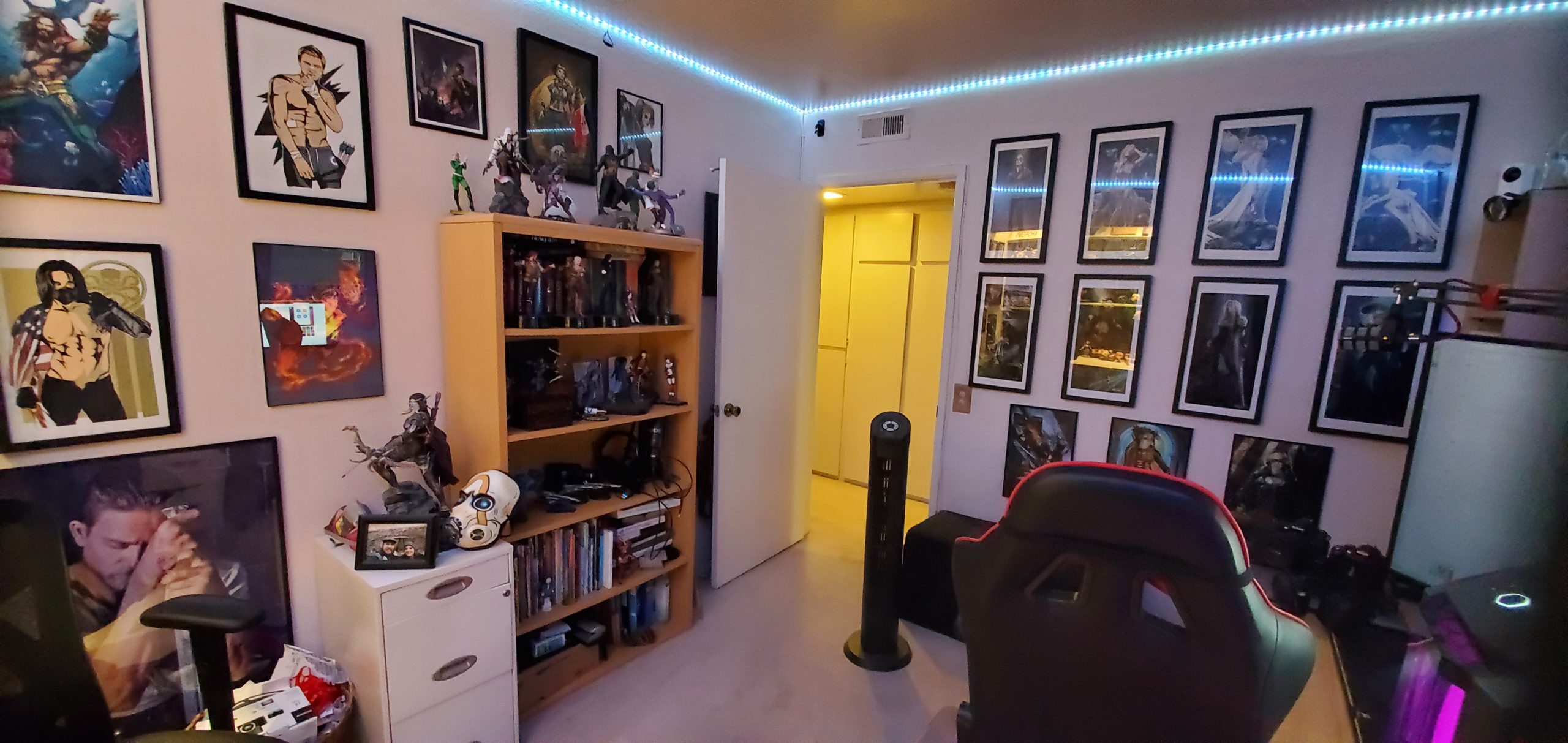
I, personally, love fantasy art. As does the Hubs. There isn’t a single wall in our condo that isn’t plastered with fantasy art. Our office, for example (an older version of my desk):
Thus, while I was adapting my notes to a novel format, I sought out an artist to draw each of our D&D characters, as I knew for certain I wanted our group to have their characters brought to life.
I searched on Twitter and Deviant Art for a bit before I reached out to a few artists for commission quotes, and happily ended up working with Jacob Grimoire (love his style and he’s super easy to work with). If you want some tips on commissioning an artist, I wrote a post on that topic.
I sent Jacob our character reference sheet and away he went! You can watch the speed paint he streamed for our characters here.
Here’s the resulting masterpiece:

I shared the art with my group and seeing the characters come to life really propelled me to finish the book’s first draft.
Step 3: Revise the Book
I played ~30 hours of the main campaign, and the original one-shot conclusion by Quinn over the course of 4 days, then wrote the 90k words or so of the first draft within 3 months of the event. That’s an average of 1,000 words per day…every day. In short: writing was brutal. But, I was already this far in, so I gave myself a couple weeks off before diving right back in for revisions.
By the way, I don’t recommend doing it like that. At all.

I usually take 4-6 months off before a revision of this magnitude so I have the ability to see my mistakes easily with fresh eyes. I was not remotely fresh, but I was damned motivated to get the project moving forward.
Somehow, I finished the revision. But, past experience has taught me that it would still be terrible in this state, and because of its length, I couldn’t ask my usual friends and #amwriting beta readers to review it for free. So…
Step 4: Hire a Copy Editor
Yeah, at this point, I couldn’t look at it anymore, but it needed help. A lot of help. I had to hire a professional.

I’ve only ever worked with developmental editors before, but I didn’t need someone to edit for plot this time–I needed line-level edits, which means a copy editor.
I tried looking for individuals online by Googling copy editors, and I reached out to a few for quotes, but the rates were all over the place and it was difficult to tell what kind of work product I would receive because the reviews were few or nonexistent.
So, I went to Reedsy (I hadn’t used it before, but its services seemed on point) and searched for and found many copy editors within my price range who provided consistent reviews by users like me.

I ultimately worked with Clem Flanagan (who has her own site, here as of 2022), and she was amazing and great to work with. Also, the Reedsy platform was easy to use and a pretty painless process.
While my editor worked over the winter holiday on line edits to make it less clunky sounding, we streamed a Christmas special (also DM’d by Quinn) with our Twilight’s Edge characters, so I typed that up and sent it off to Clem for edits as well.

Step 5: Format Your Book
This was a bit of a challenge.

I was sorely tempted to hire someone on Fiverr to format my book, but I was equally convinced that I’d be able to do it myself (I could) and save some money (I did).
After attempting to format my book with Calibre and KDP’s (Amazon) software but failing miserably, I landed on Derek Murphy’s DIY Book Formats website. I also joined his self publishing Facebook group. By the way, his YouTube channel has a lot of information about book marketing and self publishing.
Somehow, I found Derek’s video on formatting a book for print in MS Word, which is what I used to format my book for printing.
I normally hate watching video tutorials because I learn better by reading than listening, but beggars can’t be choosers, right?

The formatting video was actually informative (not annoying) and relatively easy to follow if you’re familiar with Word.
Note, the video was posted in 2015 and he now offers free templates, but this video worked out for me and I was able to format the book to about 90% completion (I had to do some finagling when I previewed it with my printer, discussed further below).
Here’s his video on doing headers and footers for the names/page numbers.
Here’s another good reference for formatting by Natalia Leigh.
Here’s my final book formatting specs:
Microsoft Word 365 for PC as of May 2020.
Anticipated book size: 6×9 (trade size paperback)
Text font: Garamond, size 12.
Chapter/subtitle font: Libel Suit Rg size 40 (title page), 18 (chapter number), 15 (chapter subtitle), 11 (top-of-page title/author name) (from Google Fonts). I used this font merely because it’s what the cover designer chose and I wanted to match.
Margins:

Body text spacing: [there’s an update from 2022]

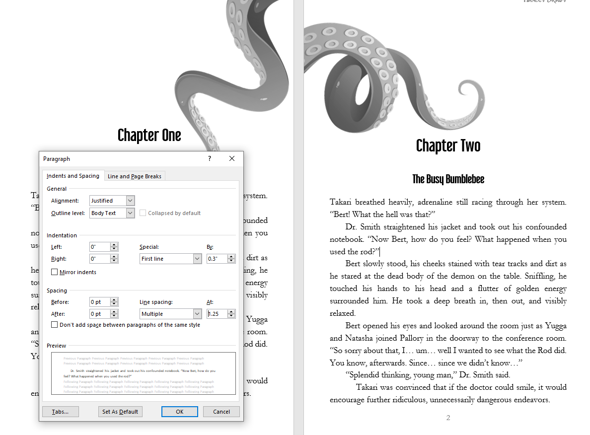
UPDATE 2022 #1: I’ve changed the INDENTATION under “Special” to “Fist Line” and 0.3 rather than the auto 0.5 I used in this printing. The indents at 0.5 were just too deep.
For reference, here’s the visual difference in the indents from Twilight’s Edge in 2019 vs my 2022 D&D in a Castle Book (in progress). The text in the second picture is just stand-in while I finish the book, but I’m doing chapter images this time too!
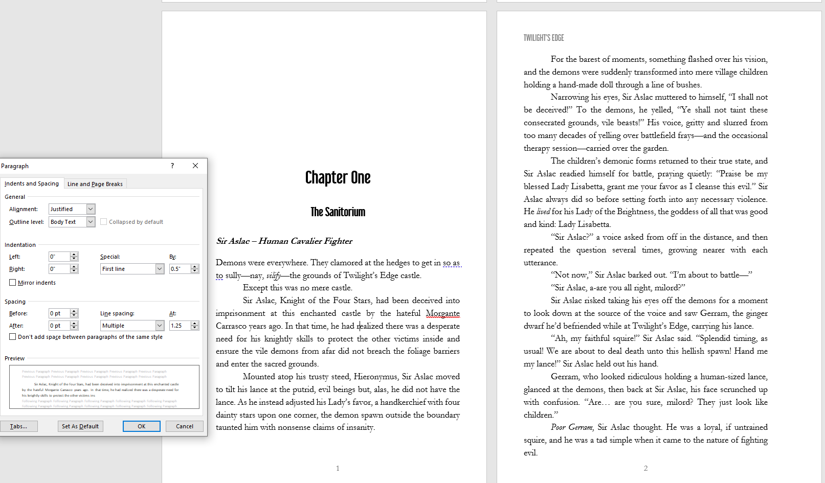
Update 2022 #2: You may want to try Line spacing at Multiple 1.15 instead of Multiple 1.25. I waffle between the two.
Chapter header spacing:

Make sure you check the paragraph button occasionally to ensure you have the right page breaks for ends of chapters and correct line enters where they should be to ensure easier formatting later for e-book (and book marks).

I also made a heading style for my chapter headings so they’d all be the same every time.

Note: the above formatting screenshots are of my final efforts after working in the Lulu previewer and seeing that the video’s formatting instructions weren’t going to work perfectly, as you’ll see in more detail below.
Step 6: Choose A Printer
I did a search comparing print on demand printers and this blog post sums it up pretty well the pros/cons of the top 4. Note that pretty much any printer, individually, will have mixed reviews of good and bad print quality. Eventually, you just have to go with one and hope for the best.

In my case, I didn’t want the option for commercial use, which means no bar code. That immediately eliminated Amazon print-on-demand because it requires a bar code to print. I also read too many negative reviews of poor quality with Book Baby, and I believe the minimum number of books to print was a bit high for my needs. At most, I figured I had about 17 people who would possibly be interested in a copy, but likely far less.
In the end, I went with Lulu Xpress. This is not to be confused with just “Lulu.com”, which is the parent company. LuluXpress seems to have a better online system, reviews, and seems to operate separately from the main Lulu company. I could be wrong, but they have separate websites that don’t redirect to each other, so I assume that’s for a reason.
One of the great selling points for Lulu Xpress is the lack of a minimum print amount.
Lulu Xpress is really easy to figure out. Also, I like that Lulu Xpress (unlike Book Baby, which will never delete your drafts or work) allows you to preview what your book will look like and start over if it’s not what you want. For example, I realized that my initial formatting efforts weren’t going to work with Lulu because the text went into the blue no-go print areas according, to the preview.

When I got that error, I was using the formatting recommended by Derek Murphy’s video, discussed above, and I reached out to him on the FB group for suggestions (i.e. was Lulu Xpress wrong and it’d be fine, or should I amend the margins to match the printer’s preview). I ultimately changed the formatting to fit within the white spaces on Lulu Xpress because then I could be (pretty) sure the text would be readable and not stuck in the gutter.
I decided to make this book a “trade” size (rather than the small paperback) because of the page length. I figured less pages = less money, and more words fit on a 6×9 book than a mass market size.
Fun Fact: there doesn’t seem to be a hard “standard” size with regard to books. Pick 3 books from different publishers on your shelf; they’re probably slightly or very different sizes.
Going through the process with Lulu Xpress was also really easy to understand, unlike most others I’d tried. First, I selected ‘book’.

Then, I added a title and uploaded my formatted doc as a PDF. Don’t mind my horrible file naming conventions…I was having issues with the software thinking it was formatted for 8.5×11 instead of 6×9 so I was testing things out when it finally worked.

Once your document is “normalized” (i.e. scanned and approved for dimensions), if you’ve done your work correctly, the book specs will show up just as you want them:

For interior color (ink) I went with black and white premium because the price difference wasn’t much, and basic Googling indicated that premium is easier to read because it’s darker.
I also went with 60# uncoated cream for the paper type because…well, frankly because it was the only “cream” option. I (personally) hate reading books with pure white paper. It’s blinding in the sunlight. Also, the heavier the # paper, the less see-through it is. I wouldn’t go below 50# but over 70# is probably unnecessary for novels.
Next, I assumed “perfect bound” meant paperback (I was right).

NOTE: As of July 2021, I’ve gotten several emails from LuLu noting that they will be raising prices of their books due to Pandemic-related shortages. It might not be this price level when you go.
I also wanted a glossy cover finish because it’s a personal preference. I don’t like how matte books will show your fingerprints forever. Note that Lulu Xpress tells you up front what your options cost (before shipping). This was within an acceptable price range for me based on the volume I was ordering. That said, print-on-demand could be difficult for an indie author to make a profit if they have to sell for more than they paid.
The next step is to upload your cover image, but I’ll skip that for now because designing a cover is another big step. Lulu Xpress allows you to preview your book, and this time, with the modified formatting, I was able to see that my text would likely fit in the blue fields.
Fun Fact: Despite being an attorney and working with Word day in and day out, I never knew the purpose of ‘different odd and even’ options for headers. Apparently, it can be used for books where you want the author’s name on one page and the book title on another. Same goes for even/odd page numbers. In selecting my header/footers, I looked through a number of books (all different in their selections of placement and order) and picked one I liked. I ended up centering the page numbers because I didn’t want to figure out the margin spacing like I did for the name/book title.

Step 7: Design Your Cover
To explain why you are likely not the best person in the world to design a cover, here’s my initial cover design (after I obtained written approval from our artist to use his character art for non commercial purposes). FYI, I’m fairly handy with Photoshop, and there are lot more layers than you’d think in here:


Legal Tip: if you’re going to make your own covers for commercial use, I highly recommend obtaining your images from places that offer images for commercial use. Sites such as Creative Commons or Pixabay would be a good start (or you can pay for images from Adobe and the like). Note, however, that if any such the image features a real person, technically there could be issues with the use of that person’s image for profit, as the artist might only have rights to the picture of the person, not the right to exploit the person’s likeness themselves.
For more on that, you can read an article I wrote about using real people in video games – it can apply to book covers too.
Anyway, I knew my cover was bad, and Fiverr has some really cheap options for cover design services. Since I wasn’t using the cover for commercial use, I wasn’t as worried about obtaining a copyright assignment from the artist etc. that I normally would care about down the road to avoid potential legal disputes.
I hired Cal and he was amazing to work with. I chose him because (1) his cover examples were numerous, (2) he had great reviews, and (3) the covers were well designed. I figured that someone with that level of Photoshop ability + design skills could easily make a cover with the character art I had. In fact it should be easier than normal.
This was his first stab at it with next to no context other than D&D:

After a couple rounds of edits (for thematic purposes because the story takes place mostly in a cloud realm), this is what we ended up with:

Now, we did run into issues with getting the dimensions to suit Lulu Xpress’s print specifications. I kept running into errors that the dimensions were slightly off, and nothing we did seemed to fix it. So, I reached out to Lulu’s support, and one of the reps sent me a PDF with the right dimensions for my book’s specific size, and Cal was able to get it to work.

As a side note, once you have your cover art, you can make a free mock up of your cover on any kind of device or book size/type here.

Step 8: Order Prints
Opening them was SO EXCITING!
I can’t imagine how exciting it’ll be when I open a box of my books.

Because I’ve never ordered print-on-demand books before, I ordered a few extra just in case some turned out bad and I could still mail them to my friends while later dealing with returns.
In this case, the prints all seem fine, although they each share the same odd defect: the last two pages are slightly shorter than the rest of the book’s pages. If it had to be something, I’m glad it was that rather than smearing, skewed text, or double printing. Pictures of the defect to follow.
First, the unboxing!


Now I checked to make sure all the text looked okay in formatting and print quality.


We didn’t have the typical publisher copyright information to include, so we went a bit tongue-in-cheek with it, and included some info about our favorite organizations. That said, since these won’t be widely distributed in print or online…guess there wasn’t much point. I’ll add the links at the end of this post.


The “prologue” (above) is the adorable theme song that Amy Vorpahl made up for our adventure, and had us sing together each session while she played the ukulele.

Below is the print defect I mentioned with the shorter last two pages. It’s odd, since the margins were the same for these pages as the rest of the book due to being in the same Word doc. My guess is that these two pages were slightly outside the cut set.

Step 9: Enjoy!

Here’s our “Copyright Notice” in full:
Amy Vorpahl, Lauren “Hanley Brady”, Miriam S, Andrew R, Quinn S, Steven K, Mike L, and to lesser degrees, Brooke Brite (1 shot), Jan H (1 shot), Bonnie Gordon (NPC), Curtis Armstrong (NPC), David Crennen (unaffiliated), Dungeon in a Box (unaffiliated), Jacob Grimoire (character artist), and Wizards of the Coast (unaffiliated). You can see why we didn’t officially publish this, right?
Below are a few amazing organizations and people we support:
D&D in a Castle – a geeky, soul-fulfilling event you’ll never forget. It’s so worth it to go! www.dndinacastle.com.
The Library Bards were our D&D in a Castle event week’s namesake, and they make awesome geeky parody songs. They now have several albums out, and music videos! See them at www.librarybards.com.
Like our character art? Need a D&D character drawn? Check out Jacob Grimoire at www.twitter.com/JacobGrimoire.
Want a premade campaign that comes with maps and standees or minis specific to the adventure? Check out Dungeon in a Box’s monthly subscription options at www.dungeoninabox.com.
Are you a creator on a budget (in the U.S.) in need of legal assistance? Check out New Media Rights. www.newmediarights.org.
Worldbuilders is a geek-centered nonprofit supporting humanitarian efforts worldwide. Check them out at www.worldbuilders.org.
lauren-hanley-brady-san-diego-attorney
lauren-hanley-brady-la-mesa-attorney
lauren-hanley-brady
hanley-brady
lauren-brady-sellers